Primary problems the design had to overcome:
The packaging featured small, hard-to-read content that didn’t clearly highlight the natural aspect of the meats, nor convey a sense of the rich, artisanal heritage of the Fiorucci parent brand. The brand’s presence was being eroded by other players with stronger, more easily-identifiable packaging.
Strategic approach and key insights:
Our strategic approach was to structure the label content in a way that allowed key information to be easily spotted, increase brand presence with an enlarged logo, while retaining brand guidelines recently established for Fiorucci’s European counterpart. In addition, an artisanal, old-world feel was injected into the packaging design, without making it feel fussy or cluttered.
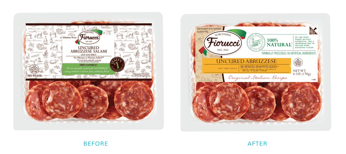
Market results:
The packaging was redesigned/launched in 2013. Early anecdotal feedback from retail buyers was exceptionally positive with regards to the redesign. The result was an immediate and substantial increase in sales of 25% year-over-year change from 2013 to 2014. The success of the primary roll-out spurred the addition of several new SKUs to this product line, based on its above-average performance. Fiorucci is now the 2nd largest natural meat brand on shelves and has regained its “#1 brand in Italy” leadership brand status.