Primary problem the design had to overcome:
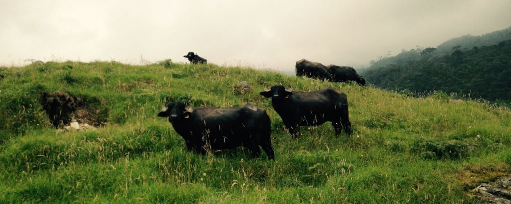
As a totally new brand entering a market, BUF had to establish itself as an excellent choice for mozzarella di bufala (buffalo milk mozzarella), and compete with the imported Italian products, which are made with a lesser quality milk. The grass-fed Columbian milk was far superior, and BUF needed to express this with a compelling brand voice.

Strategic approach and key insights:
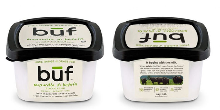
Our strategic approach was to come up with a strong, iconic name and create a brand identity and packaging format/structure that was both visually appealing and provided strong product integrity to the consumer. The brand visuals are meant to clearly and swiftly convey what makes the product different – free-range, grass-fed buffalo milk mozzarella cheese.

Market results:
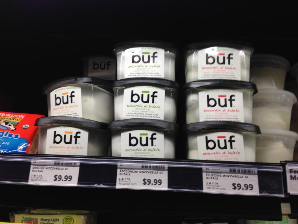
The product had only been on the market for less than a year (as of this writing). In the short span of 6 months BUF was nationwide at Whole Foods. Their global cheese buyer called it the ‘best discovery of 2014’. It was then sought after by several major grocery retailers. Retail store managers love the packaging integrity (doesn’t leak), and favor the packaging aesthetic, calling it meaningful and compelling in a lackluster market space (of over 120 brands). The brand is poised for rapid growth through 2016 and beyond.

