Manischewitz is a 120-year-old heritage brand best-known for matzo and other Jewish foods. Over time, the brand was becoming less relevant to younger consumers. The Manischewitz product portfolio spans hundreds of SKUs in a wide range of product categories, making it even more challenging to rebrand.
The Manischewitz brand position of “kosher heritage foods” was emphasized on their packaging.
To get to the heart of the matter, we did a strategic product audit (SKU rationalization). We learned that the packaging was not consistently expressing the brand values and did not speak to the rich brand heritage it had built up over generations. Instead, it was eroding.
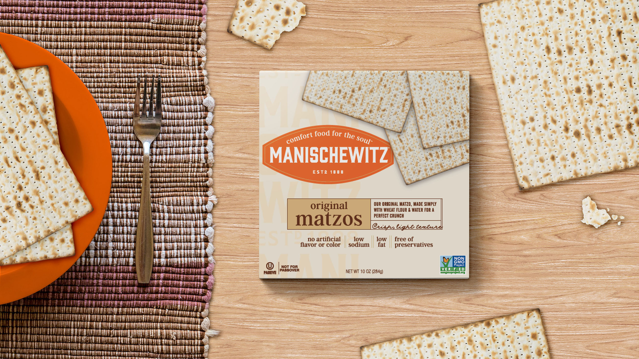
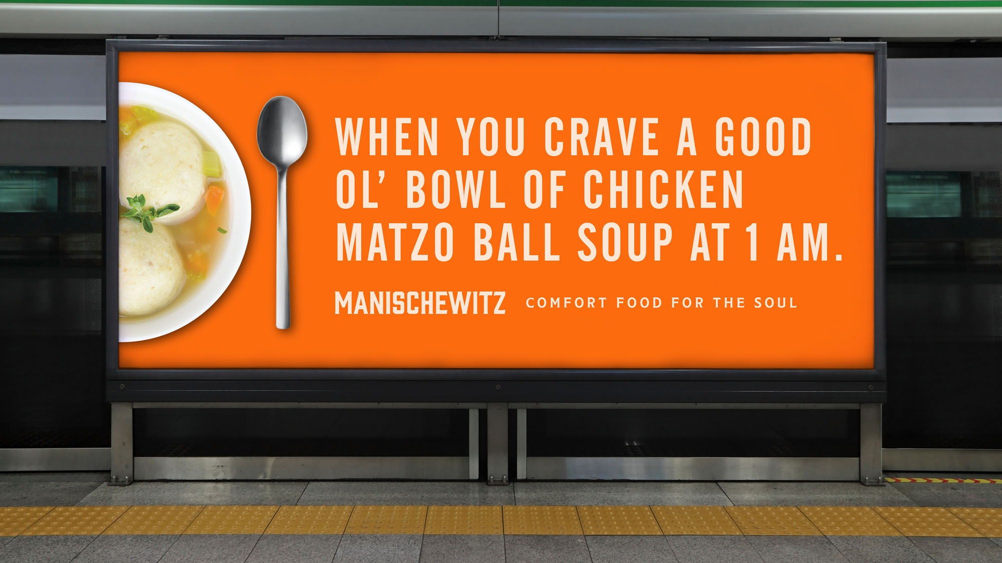
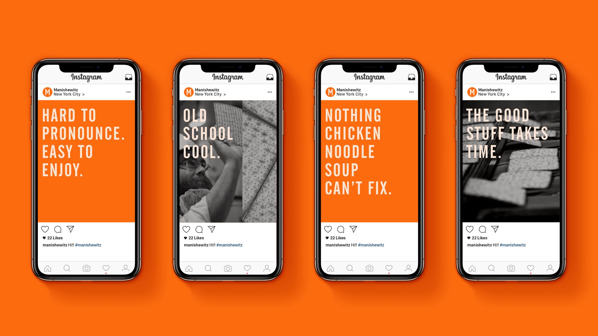
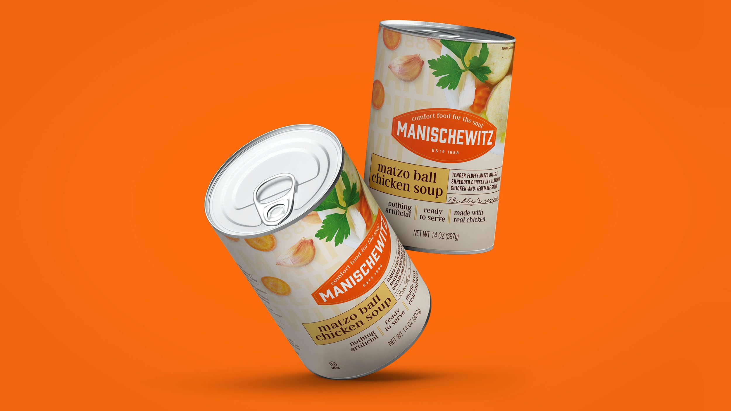
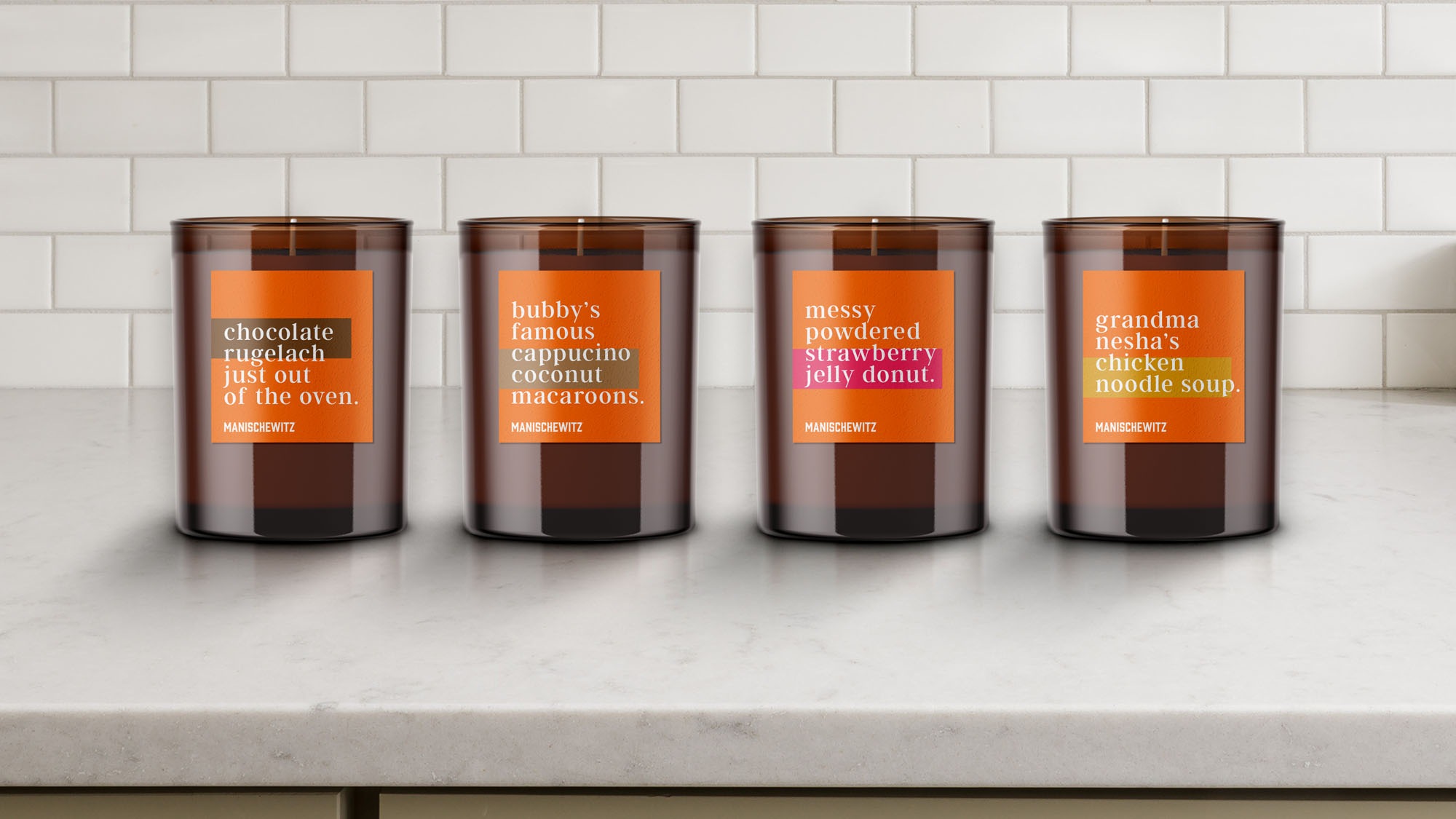
We established a fresh brand position “Comfort Food for the Soul™”. Manischewitz is a brand with over a 120 years of making Jewish “comfort foods” that were beloved by generations of consumers worldwide.
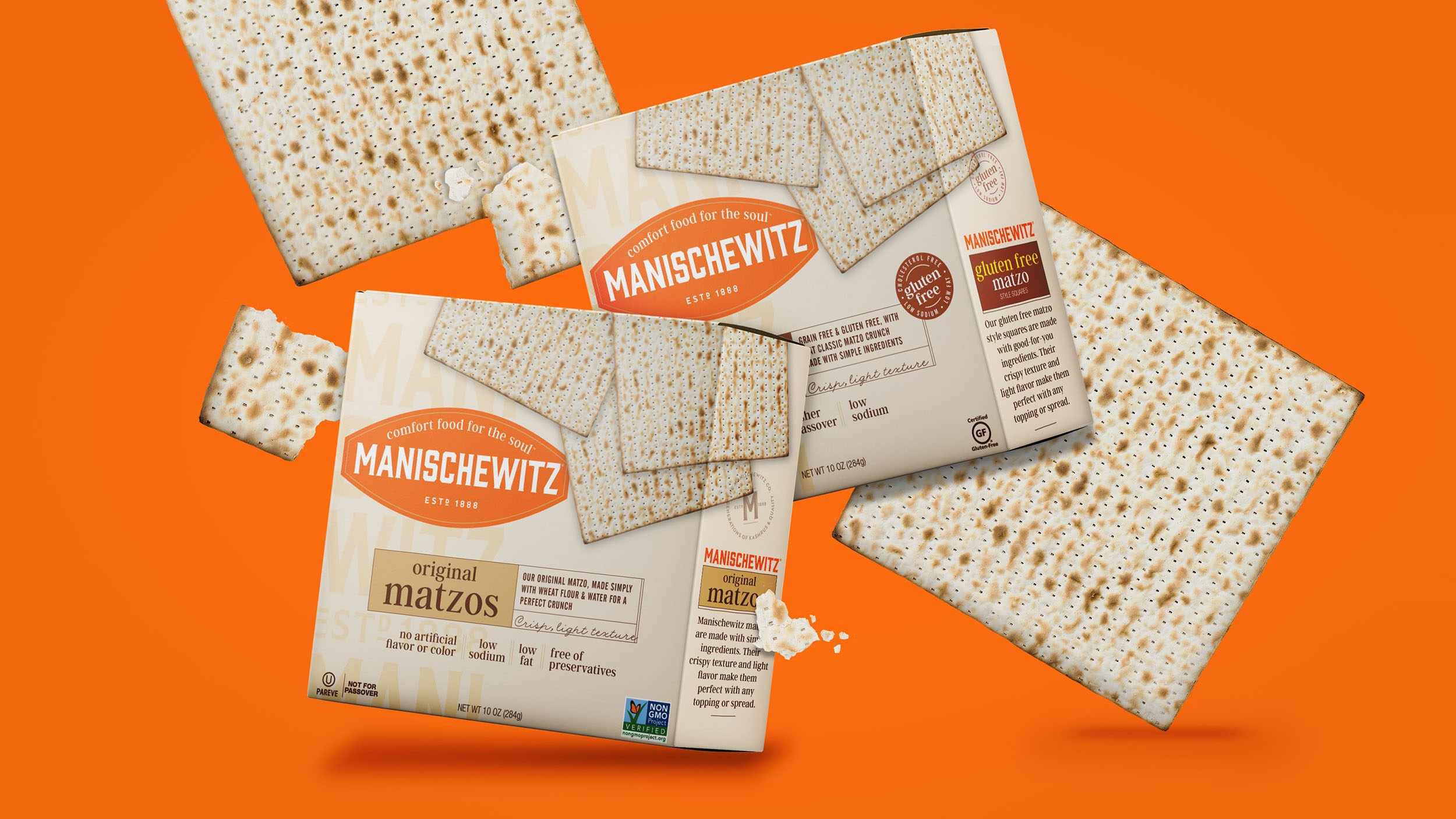
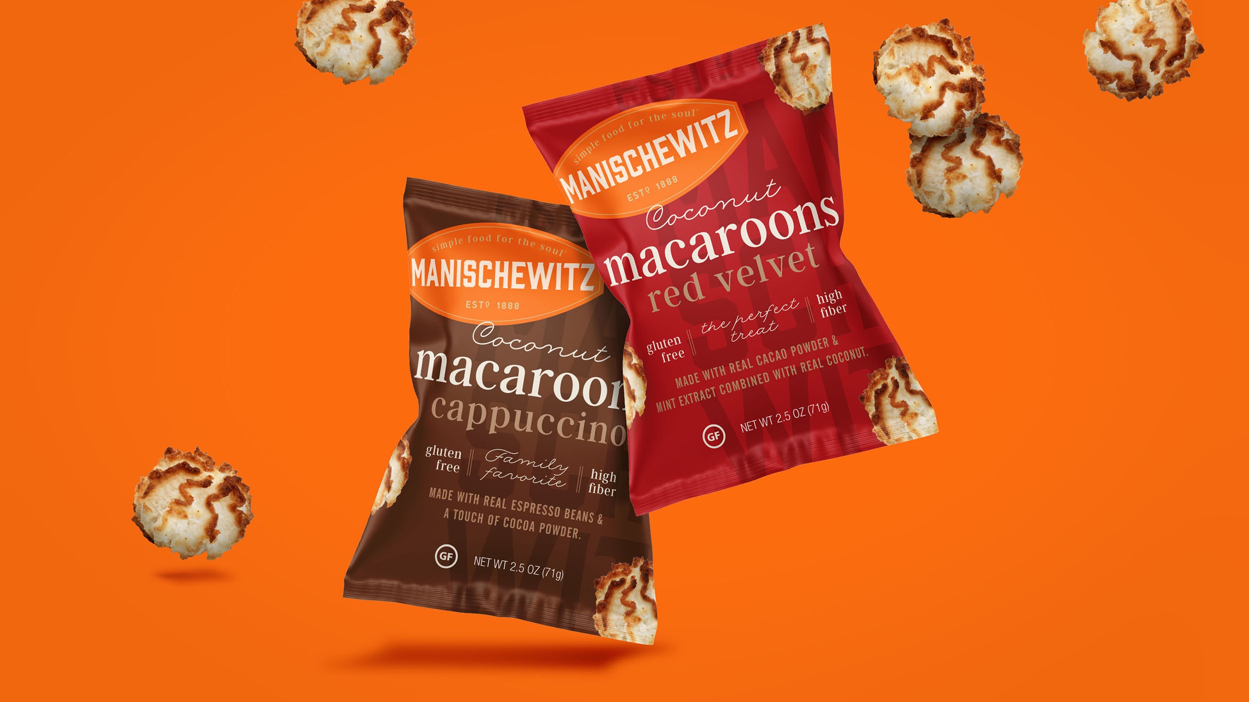
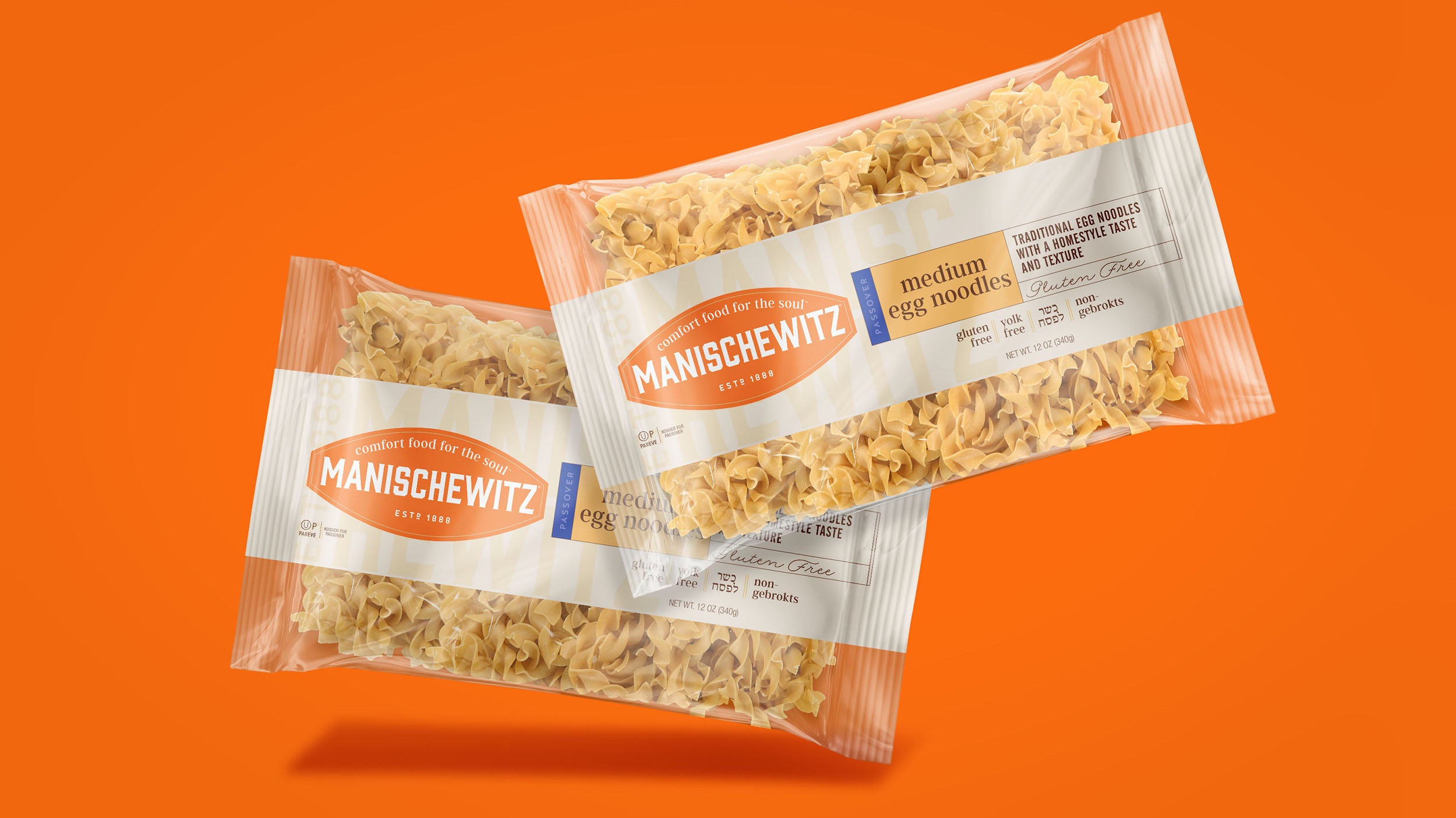
The new Manischewitz logo emphasizes the iconic “Manischewitz orange” color. A heritage-inspired typeface and classic marquee shape honor the brand’s rich past.
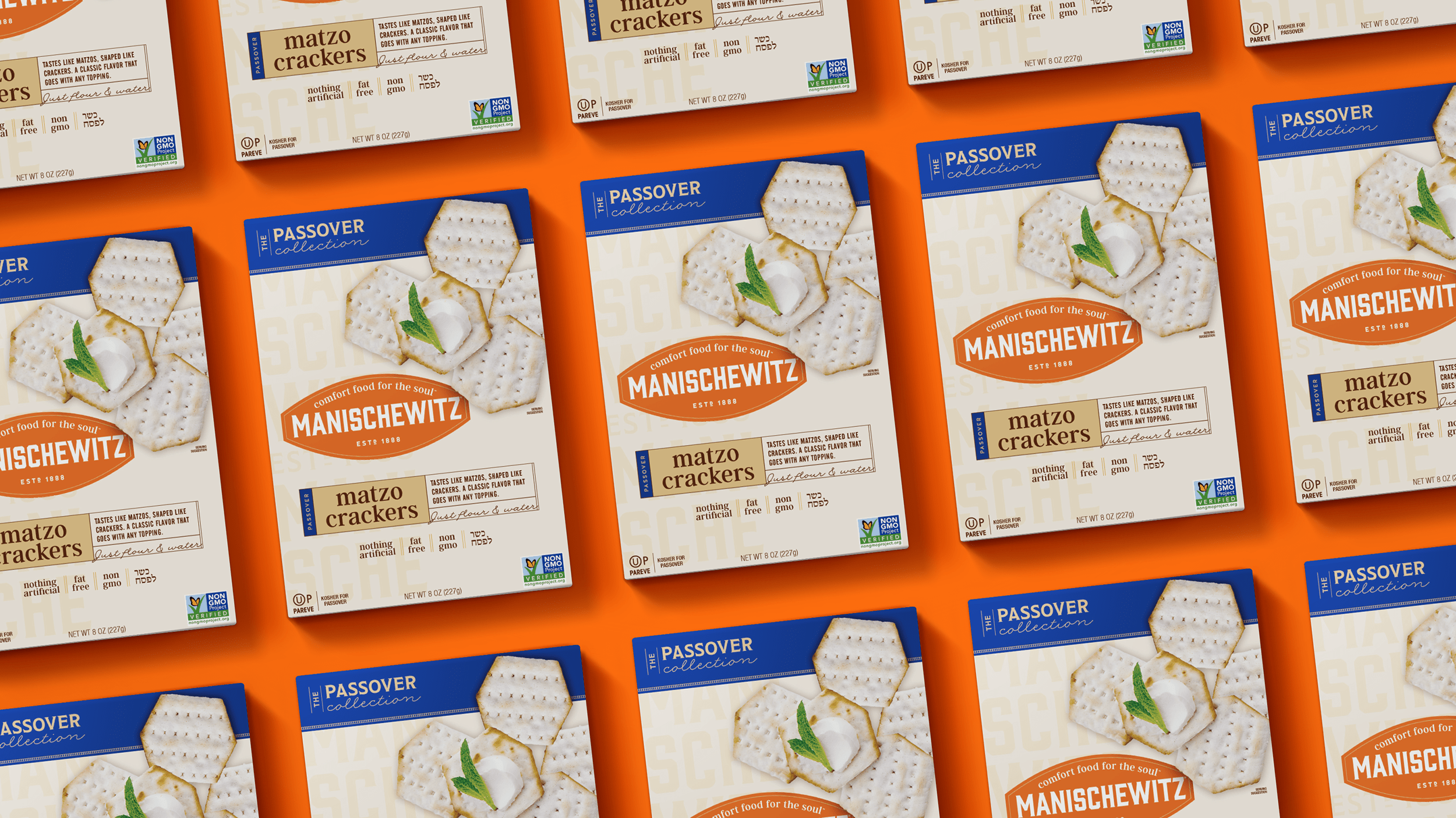
The refreshed packaging reorganizes Manischewitz’s extensive product lines, with items grouped by their typical use. Pantry basics maintain a consistent, clean look that is easy on the eyes, and easier for consumers to navigate. The warm tone feels classic and trustworthy without feeling heavy or old-fashioned.
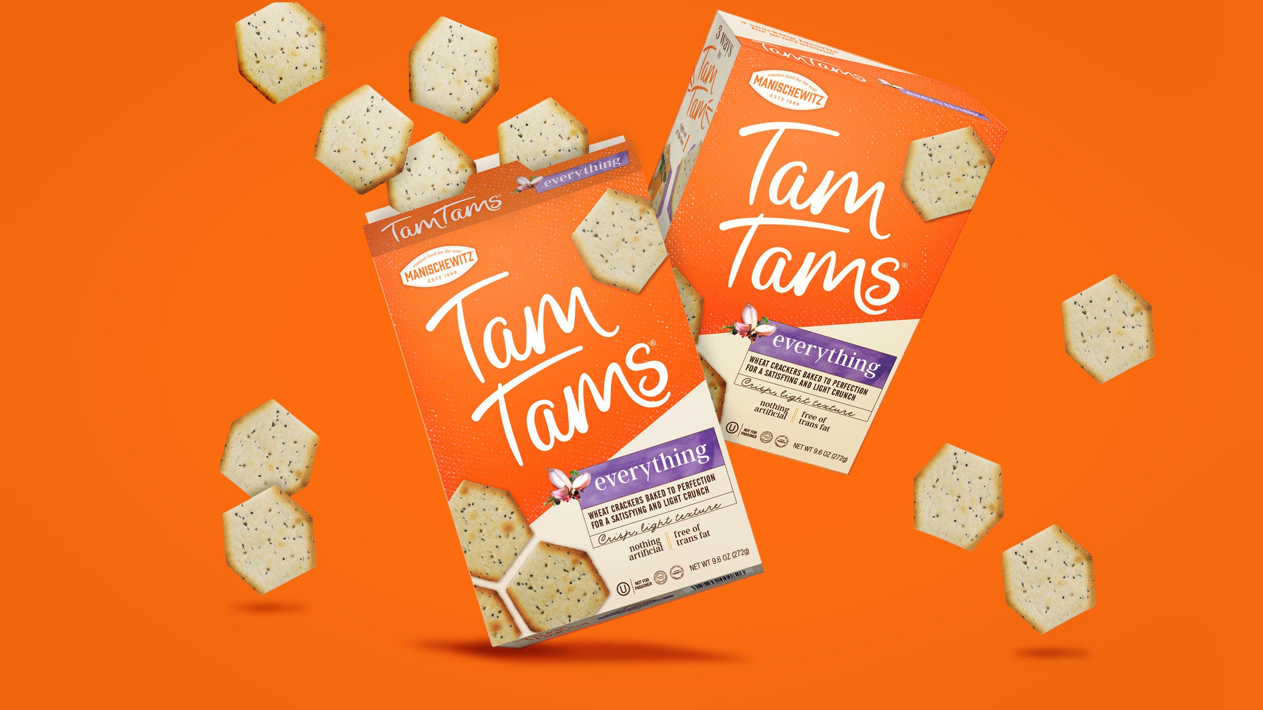
Sub-brands like Tam Tams™ crackers gets its own lively and vibrant look, to help it better compete among other crackers in the snacking aisle.
Before the rebrand, it was hard to tell apart year-round products from Passover products. Now, the Passover products are better differentiated after we created a consistent “Passover Collection” banner system.
The Manischewitz rebrand was a rapid success, and within a short period of time, was purchased by Kayco/Kedem Corporation, in what would be its largest brand buyout in its history.
After the initial launch, we continued to work with the brand to refine and improve their product lines. Watch this space to see what’s coming next.
